

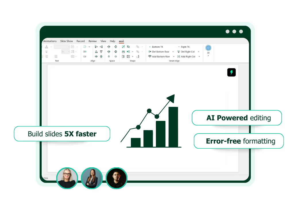
See auxi in action
your workflows and save you time!
PowerPoint presentations sit at the center of how management consultants, analysts and finance leaders think, communicate and persuade. Strategy is articulated and debated in slides. Yet, many presentations underperform.
There are a few recurring PowerPoint mistakes that show up again and again in consulting decks, board materials, investment committee packs and proposal presentations. These presentation mistakes do not just weaken slides visually, but distorts the messages, slows down decision-making and undermine credibility.
With presentations, the goal is to maintain a strong audience focus and avoid common PowerPoint mistakes can support the main message better. But what are these mistakes? And are you making them? Let's find out!
Mistake 1: Using slide titles that describe topics and not insights
Using vague or descriptive slide titles is a pervasive PowerPoint mistake. In consulting slides and financial decks, you'll often find titles like "Market overview", "Financial analysis" or "Operating model".
During presentations, the audience especially execs scan titles to understand the storyline before engaging with the content. When titles simply name a topic, they force the audience to infer the point of the slide on their own.
The solution? Insight-driven titling.
A strong slide title should clearly state the conclusion you want the audience to take away. Each slide should focus on one idea to ensure clarity and make it engaging. It must read like a headline, and not a label.
For example; instead of stating "Pricing Analysis" you can use "Current pricing leaves 12% unrealized margins". This dramatically clarifies your message.
Mistake 2: Treating slides as documentation instead of decision tools
Another common PowerPoint mistake we see often is using slides as documentation instead of decision tools. Too often slides are built to record effort, rather than guiding a conversation towards a conclusion.
You'd see this often in proposal decks, internal readouts, or diligence presentations where teams feel the pressure to demonstrate effort. This leaves slides to feel like dense repositories of analysis, background and methodology - leaving the entire presentation to be unclear.
If you're presenting to executives, this doesn't really fly. Executives are there to make decisions, validate direction or challenge assumptions. But when overloaded with context, the discussion drifts into clarification.
This requires a mindset shift. Each slide should move the audience to make a decision. That means prioritizing implications over process and conclusions over completeness. It's essential that each slide communicates its key takeaways clearly, so the audience can quickly grasp the main message and act on it. Supporting detail should live in appendices, not on core slides.
Mistake 3: Overloading slides with text to compensate for uncertainty
How many times have you seen someone open a text-heavy PowerPoint presentation and felt your brand immediately switch off?
Its one crucial mistakes professional make, especially consultants and finance professionals. All you see is long paragraphs, exhaustive bullet points and dense explanations.
Too much text on slides can overwhelm your audience since it makes slides dull and look cluttered. So instead of heavy text, transforming to supporting content and engaging visuals can improve your presentation significantly.
And we understand the logic; more text would mean more context and better information, however, with slides that is not the case. Your audience doesn't read presentations line by line - they skim. This also leads to awkward pauses, fragmented discussions and repeated explanations which require a lot of clarification in follow up and post email meetings.
But there is an easy fix to this: trust your narrative. Your presentation should provide structure, not narration. You can add key takeaways into your slides that leave a lasting impact.
auxi as a powerpoint productivity tool allows you to optimize your content easily with its GenAI editing features. You can rewrite content as a consultant, investment banker, a project manager and even Taylor Swift. It also helps you autocomplete slides, optimize content, shorten paragraphs and consolidate your lists.
When slides look complete, teams are more willing to let the narrative do the work.
Mistake 4: Inconsistent formatting that signals lack of rigor
Visual precision is interpreted as analytical precision, especially in consulting and finance. However, it is often, you'd end up with formatting issues that are highly dangerous to your overall pitch.
We're talking about misaligned charts, inconsistent font sizes, uneven spacing, and varying color usage that are not aligned with your brand guidelines. Failing to use a clean design without overlapping is crucial for your narrative to land and for your audience's attention.
Now granted, most of the people looking at your slide deck won't point it out immediately but it breaks trust, and by extension, also the analysis.
And when it comes to proposal decks, board presentations and investment committee materials, formatting is crucial.
Formatting issues often lead to late-night rework, and doesn't necessarily scale. Ideally, you want to be using a PowerPoint productivity tool to standardize your work with templates, layouts and assignment rules.
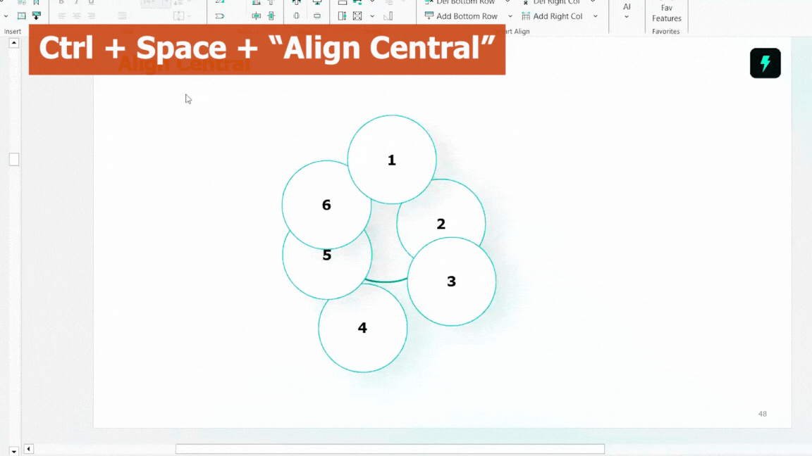
With auxi, you can make formatting seamless through features like Checker, AI Editing and Smart Alignment.
Here is an example of how you manage alignment within auxi.
Mistake 5: Charts that show data but hide insight
Another common mistake is often found on chart slides. Although, most charts are technically accurate, they can be analytically ineffective. Typical issues include too many data series, unclear axes and missing labels.
Inaccurate charts lead to unproductive discussions and instead of debating implications, the room debates definitions, time periods and calculation logic. The strategic conversation stalls.
When designing charts, it is important to design around a single insight.
This might mean simplifying and removing secondary data or using color selectively, but that is the goal and annotations can help guide interpretation without overwhelming.
You can use auxi to create better looking charts at scale. Here is an example of what a Gantt Chart looks like in auxi.

Mistake 6: Poor narrative flow across the deck
One of the most strategic PowerPoint mistakes is failing to manage narrative flow across your deck. This is commonly seen in large teams where each section or a group of slides have multiple contributors and cracks show.
Often you'd notice jumps between topics, repeated context or pre-analysis conclusion. It's needless to say, you'd also find inconsistent branding and mismatched fonts and colors.
A presentation is not a collection of slides. It is a structured argument. One of the most strategic PowerPoint mistakes is failing to manage narrative flow across the deck.
All of these combined increase cognitive load and the audience spends time trying to understand where the presentation is going rather than evaluating the recommendations. Questions interrupt the narrative, and momentum is lost.
Ideally, you want to define the storyline. One that clearly governs questions and each section logically advancing the argument.
Mistake 7: Designing for internal logic instead of the audience
Lastly, if you're working on a deck for a few months, eventually, it will make the most sense to you but sometime you might be the only one. Since the deck is built on internal logic, the audience may not fully understand it.
As a result, presentations often include excessive methodology, unexplained jargon and/or assumptions that are obvious to you but not to fresh eyes - a common problem in client pitches, board meetings and fundraising slides.
But you can fix this easily by taking an audience centric approach. You must ask what the audience needs and what you want them to understand easily. Using icons to visually support key points can also make slides more engaging and help communicate ideas more effectively than relying only on text.
Branding Compliance: Ensuring Consistency and Professionalism
Branding compliance is a crucial yet often overlooked element in effective PowerPoint presentations.
Inconsistent fonts, colors, logos, and layouts can undermine your credibility and distract your audience from the core message.
Ensuring branding compliance means every slide is polished, professional, and on brand, which builds trust and reinforces your organization’s identity across the entire presentation.
To maintain branding compliance, use standardized templates and color schemes aligned with your brand guidelines. Consistently apply legible fonts and font sizes for body text, and maintain clear contrast between text and background to keep content hard to miss. Incorporate your company’s logo thoughtfully, avoiding clutter on one slide.
auxi helps you automate these processes, helping you produce on-brand decks quickly. For instance, with auxi, you can transform individual slides and decks to match your brand guidelines with one click. Moreover, you can transform charts, tables and shapes as well.
Checking Slides: A Final Quality Control Step
Nothing kills the impact of your presentations more than typos, grammatical errors and awkward phrases. If you're having to present, it is probably important. So, this shouldn't slide. But it is understandable that checking 100+ page decks is tedious work.
Ideally, you want to develop a habit of reviewing your work thoroughly before presenting. A great way to ensure accuracy is reading content out loud and using short phrases to catch awkward words.
Furthermore, before delivering your presentation, a thorough deck check can prevent last-minute surprises and technical glitches. Checking slides involves verifying slide formatting, alignment, image quality, and functionality of embedded media. It also means ensuring animations and transitions are purposeful, consistent transitions that direct attention without distracting backgrounds.
PowerPoint has built-in checkers but it goes a step further with auxi. auxi's checker feature looks through extensive decks to find formatting issues, double words, multiple spaces and empty placeholders. This is crucial for consultants working on decks that have 200 slides or more.
The role of AI in reducing PowerPoint mistakes
AI is increasingly shaping how professionals work, and presentation creation is no exception. In consulting and finance, the value of AI is not in replacing thinking, but in removing friction from execution.
Many PowerPoint mistakes persist because professionals spend too much time on low-value tasks like formatting, alignment, and layout adjustments. This leaves less time for refining insights, improving narrative flow, and stress-testing conclusions.
AI-powered tools like auxi address this imbalance. By automating repetitive PowerPoint work, auxi frees up cognitive capacity for higher-order thinking. AI also helps teams avoid default PowerPoint designs by enabling the creation of customized, professional presentations that stand out from generic, uncustomized templates. The result is not just faster decks, but better ones.
When formatting is handled consistently, teams can focus on clarity. When slide structures are standardized, narrative issues surface earlier. Over time, this leads to fewer PowerPoint mistakes and more confident presentations.
You may also like: 11 Tools Every Consultant Should Know About in 2026
Final thoughts: Fewer PowerPoint mistakes, stronger outcomes
PowerPoint mistakes rarely announce themselves. They accumulate quietly, slide by slide, until the presentation feels heavy, unclear, or unconvincing. In consulting and finance, where credibility and clarity are everything, the cost is high.
Avoiding these mistakes is not about design flair or working longer hours. It is about discipline, structure, and focus. Slides should exist to support decisions, not document effort. Insight should be explicit. Narrative should be intentional.
Tools like auxi do not replace judgment, but they create the conditions for better judgment by eliminating unnecessary friction. When professionals spend less time fighting PowerPoint, they spend more time thinking.
If you want to see how AI can help you reduce PowerPoint mistakes and create more effective presentations, consider booking a demo to explore how auxi supports better slide creation for consultants and finance leaders.
After your presentation, consider sharing a post or supplementary resource to reinforce key messages and provide additional value to your audience.